General Assembly UX Design Immersive
Client Project
Alicia Geller Product Manager/ UX Researcher
Liv Leopold Product Manager/UX Researcher
Yaz Mohamed UX/UI Design
Lasalle Frazier UX/UI Design
Plant the Studio, a Brooklyn-based plant shop and greenhouse; known for its expertise in rare and uncommon plants, was looking to improve their website’s usability.
Plant the Studio’s co-founders had built up a solid Etsy business over the past 2 years, with sales really increasing during the pandemic. For a long time, they had counted almost exclusively on their Instagram following to drive sales, but they soon found that their website wasn’t up to date with product demand.
They were looking to broaden their customer base and improve the user experience of their website to drive traffic to their website directly, instead of through Etsy.
Role, Scope & Duration:
This was a 3 week Group project, where I focused on User Research,
Content Strategy and Project Management to deliver the following:
UX Audit. At Plant the Studios’ request, we did a complete UX audit
of the existing website.
Design. We created a high fidelity prototype in Figma, with a focus on improved
navigation and information architecture.
Problem Statement:
User needs to be able to easily navigate website to find and learn more about rare plants and the shipping and handling process including the “Winter Plant Guarantee” insurance.
How Might We:
1. Increase consumer confidence in the website and in ordering plants online.
2. Improve website usability: To drive traffic and sales from Etsy to Plant the Studio’s own website.
3. Give better detailed explanations of the plants and other inventory items and reduce the amount of customer service related follow up questions.
Challenges, Constraints and Proposed Solutions:
The limitations of their existing Shopify website template :
By creating a high fidelity prototype in Figma, we showed the client how they could have greater control over the design and functionality of the website.
The disorganized Information Architecture and Main Navigation:
We conducted open & closed card sorts and comparative research to better sort through the inventory categories, as we ourselves learned more about the plant categories and many one- of- a kind items.
We consulted with a few rare plant collectors to get a better understanding of rare plants and the tools and accessories used in caring for them.
We landed on a more intuitive way to sort the inventory, which provided better descriptions of the product categories and other specialized products used in the planting and propagating process.
The FAQ Page:
We added a new page that provided more clarity about the shipping and handling process. This instilled greater trust in Plant the Studio’s business.
We included a detailed explanation of the ‘Winter Plant Guarantee” with an “add on” to the checkout flow. This made checkout flow more seamless and thorough and ensured that users didn’t miss the opportunity to purchase this important insurance coverage.
The very brief “About Us” section was missing compelling storytelling:
I wrote a bio/summary of Plant the Studio’s story. I embellished their story to strengthen their brand identity and credibility as Rare Plant Sellers and Collectors. A key part of the story was explaining how the name “Plant the studio” literally meant “Planting their studio (apartment.)”
This summary really helped establish Plant the Studio’s brand identity. Adding a photo of the founders also made the website more personable and engaging, as we later learned in our usability testing.
User Research:
We applied the “double diamond” UX process to develop a plan and came up with the following goals for Plant the Studio’s website:
Have multiple clear ways of locating specific items.
Have clear product description pages.
Have information about caring for plants and recommended tools & supplies.
Steer customers towards getting a “Winter Plant Guarantee” - a type of plant insurance for shipping during colder months.
-
We conducted in-person user interviews and sent out a survey asking whether users had or would purchase plants online and what they would look for in a website that sells live plants
-
We conducted open and closed card sorts to sort through and organize the specialized, often one-of-a kind inventory items.
-
We watched 5 participants interact with the existing website and observed what their pain points were.
Information Architecture & Learnings:
Optimal Open Card Sort: We relied on this trusted industry tool, which I sent out to 20 participants who created their own categories such as: Accessories, Plant Care and Merchandise and moved the inventory photos to the categories they named and grouped themselves.
Learnings: It was difficult for participants to sort items when they were not familiar with the names or the items.
Closed Card Sort: Based on the results of the Open Card sort, we decided to do a Closed Card sort to ensure that each item in the Plant the Studio inventory was represented and assigned to the appropriate category.
Learnings: As we became more familiar with the plant categories and the inventory in general, we decided to organize the inventory in a straight-forward, logical way, that would make sense even to someone not familiar with rare plants.
Optimal Card Sort Results
Comparative Research
We looked at many different websites: from big box stores to specialized plant stores to analyze the Information Architecture. We found that Great Gardens Plants had the most intuitive navigation and descriptive product cards that could translate well for our users.
Design Iteration & Prototype
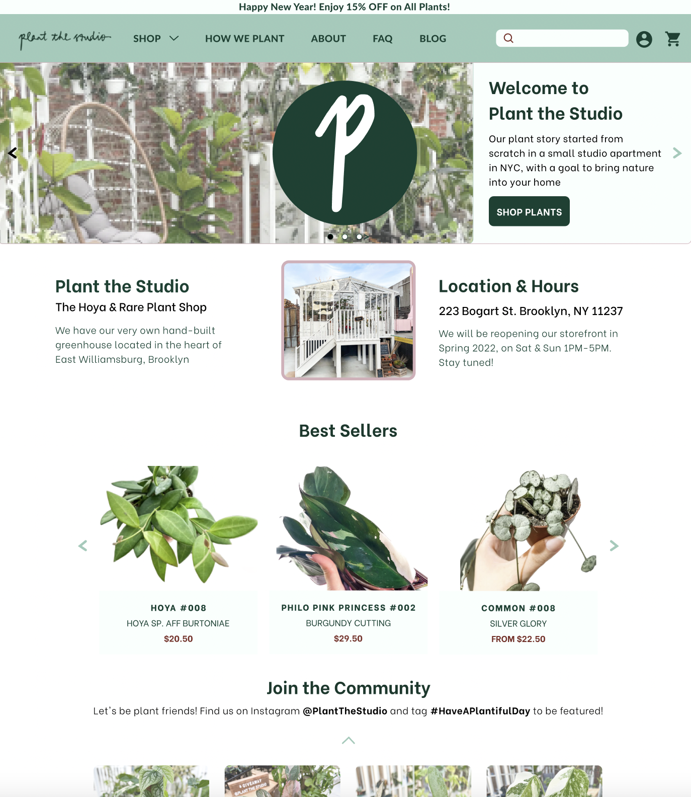
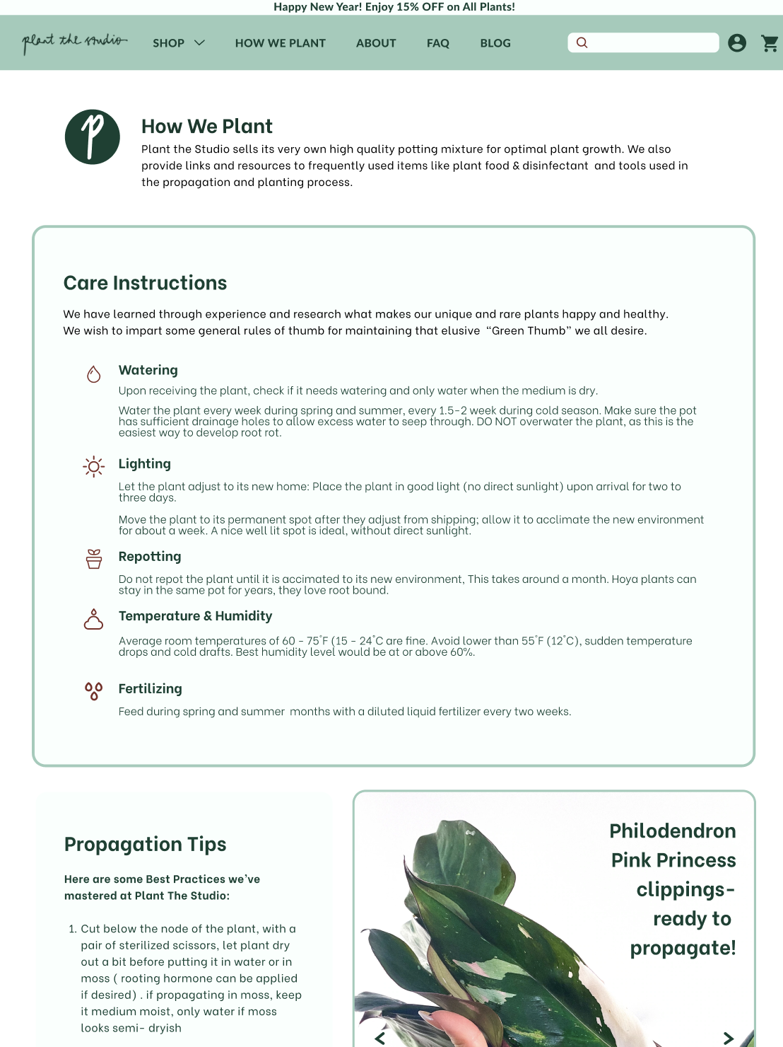
RESULTS: We created a high fidelity working prototype in Figma which included a homepage, category pages, product pages, cart and checkout pages.
Click on Prototype button and See images below for Prototype pages.


Prototype Iterations & Usability Testing
For our prototype, we created user flows for 2 personas.
Userflow 1: For the more Experienced plant collector.
This user flow involved picking out 2 rare plants (a Hoya Mathilde and a Pink Princess Philodendron) and then adding the “winter plant guarantee” to the checkout flow.
Userflow 2: For the Beginner plant collector.
This user flow involved browsing the website to gather more information; viewing the “About Us” and FAQ pages, before checking out the Common plants page and then purchasing a Begonia house plant with added “winter plant guarantee”.
-
We conducted 2 rounds of Maze tests with 8 users. Final usability score improved to 87.5 %, after 2nd round.
Users found improved navigation, especially through main menu.
-
We observed our original participants navigate through our 2 user flows and noted that they were happy to see that we had implemented the changes they had called out from original website.
-
Based on the user testing we concluded that users would like to see more videos of processes like packing & shipping and “how to propagate” tips. We then added more Gifs to our prototype to make it more interactive.


